


The Many Colors of Marketing
September 7, 2016 | By Cirrus Visual
The term “brand” is one that is used frequently by marketing and graphic design agencies, and recognized easily by consumers. One may prefer one “brand” over another, and may not even be sure why. But what exactly is a brand, and what all does it entail? If you look up a proper definition, you’ll find that it is a name, term, sign, symbol or design, or a combination of the above, intended to identify a company’s products or services. A brand communicates the “idea” of a company or product, which is what forms the connection to consumers. Therefore, it can be assumed that a brand needs to have a personality in order to make that connection.
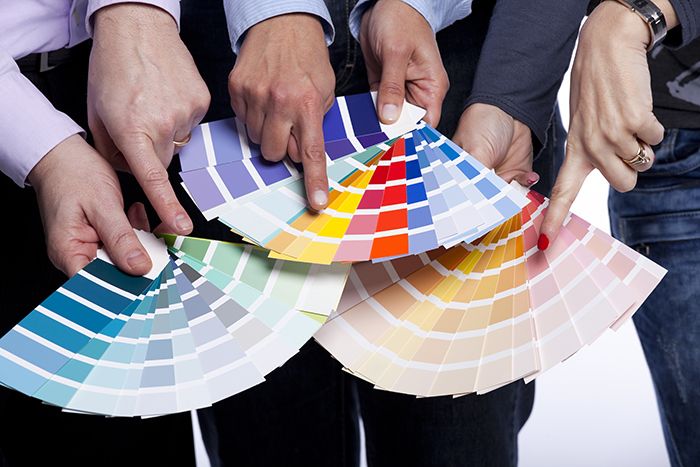
There are many factors that go into establishing your brand’s personality: shapes, symbols, numbers, words, and colors in a logo will all play into projecting a lasting image to consumers. The most important of these things, however, is color.
Color preferences are far from rational, and deeply rooted in the human psyche. Color influences our choices in everything we do from the purchases we make to the food we eat. Biologist Theodosius Dobzhansky pointed out in 1973 that this can’t make sense to us unless we see it through the lens of evolution. Humans evolved to develop innate preferences towards colors that were associated with positive experiences, or health, such as clean water and blue skies, and to be repulsed by colors that were associated with negative experiences, or decomposition, such as rotting food.
Color association is also important, however, meaning that brown hot chocolate mix would not be viewed unfavorably, but brown tomato juice would be. Even though tomato juice will naturally be brown, we associate the color red with tomatoes, so anything else would seem unappetizing. For this reason, food manufacturers add color enhancing chemicals to products simply to make us more attracted to it (and therefore decide to purchase it). We don’t need our food to be dyed different colors, but it enhances its appeal. Similarly, we don’t need to add color to our marketing, but it won’t pack the same psychological punch it would if it was simply in black and white.
60% of the time, people will decide if they are attracted to a message based on color alone. Ads in color are read 42% more often than in black and white. And since 73% of purchasing decisions are made in-store, this makes color in branding and advertisements all the more important.
People make decisions about a product within 90 seconds of their initial reaction, and 92.6% of people will place most of that importance on visual factors. Research has proven that consumers will see color before they see anything else about a brand, and they will remember that color more often than they will remember the shapes/symbols, numbers, or words. Additionally, 90% of purchasing decisions are made based on color alone. Clearly, our brains place a high level of importance on color, even if we don’t realize it.
One thing to keep in mind is that color provides value beyond aesthetics. Think about a landing page, for instance. The biggest eyesore on your page could be the biggest contributor to leads or revenue, simply because it stands out. Sometimes, you just need to get someone’s attention in order to make a sale, and this is what color can do.
If you haven’t put extensive thought into what colors to use for your brand, it’s time to get on the wagon. When the Forbes List of 100 Most Valuable Brands was broken down, some clear patterns were found with regard to color. Let's take a look at those patterns and figure out what we can learn from them
First, we should note that color usage and variance is not very wide. The colors used by most companies were red (28%) and blue (27%), with only one of the top 100 using purple.
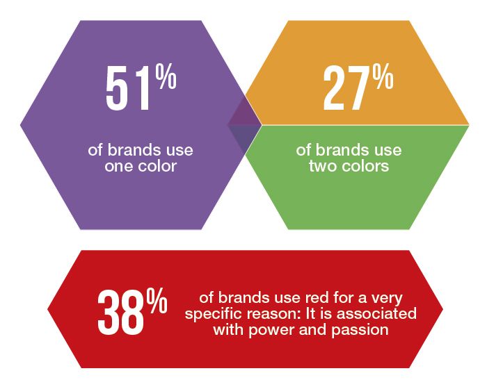
Only 27% of brands used two colors, and 51% use ONE color only. This tells us that using color is less about making a brand “pretty” and more about the effect that a specific color has on the brain. All of these brands were simple and memorable. While the brand itself isn’t complicated with excessive wording or too many colors, the psychology behind it is quite complicated.
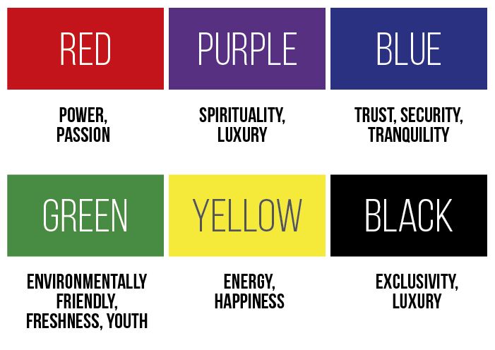
38% of the 100 Most Valuable Brands use red, and for a very specific reason: It is associated with power and passion. The color red has also proven to increase heart rate and blood pressure (more on color symbolism below). Companies will use red when they want their target audience to get excited about their product. As you can see, designers will use specific colors not because they like them, but because they evoke specific emotions that influence people to buy their products.
Also something to keep in mind is that the majority of these Top 100 companies used “pure” (not mixed) colors. That said, there can be some benefit to using mixed colors. For instance, if you own a hair salon, colors mixed with white, which are lighter and perceived to be more feminine, might be a better option.
As you can see, there is a lot to consider when it comes to color usage in branding. How does your business currently utilize color to its advantage, and what will you do to improve its connection to the consumer? It is important to consider colors and their implications in detail before moving forward, as this is everyone’s first impression of your brand.
Resources:
https://www.quicksprout.com/the-complete-guide-to-understand-customer-psychology-chapter-4/
https://www.psychologytoday.com/blog/the-new-brain/201104/why-we-prefer-certain-colors