

CASE STUDY
Benson Hospital Logo Redesign
CLIENT Benson Hospital
PROJECT Benson Hospital logo redesign
NEED Update the Benson Hospital brand to reflect affiliation with Tucson Medical Center (TMC)
SERVICES Graphic Design
CHALLENGE Develop a new identity for Benson Hospital that showcases its new affiliation with TMC while still paying tribute to the strength of the Benson Community.
SOLUTION The new logo combines elements of TMC’s branding – radial arches – while reflecting Benson Hospital's existing community identity. The ocotillo complements TMC’s saguaro symbol while also referencing Benson Hospital’s location on Ocotillo Drive.

The original Benson Hospital logo has been around for as long as anybody can remember, its origin and meaning unknown. Not only was this an opportunity to integrate the TMC affiliation into the new identity, but it presented an opportunity to connect the hospital’s identity to the Benson community.

The existing suite of TMC logos presented a clear design challenge – develop an affiliate logo that works in cohesion with the existing suite while still representing Benson Hospital as an individual healthcare provider. We looked at the radial arches as a design element that would compliment the new Benson identity while still referencing TMC’s visual brand.

Using the radial arch from the TMC logo, we created a series of ocotillo branches that follow along with the curve from the logo to create a mark that resembles the TMC logo, which visually fits within the suite of logos and features a plant also native to Southern Arizona. The ocotillo is a nice complement to the saguaro and closer to what you might find in Benson
Further solidifying the use of the ocotillo in the logo, Benson Hospital resides on Ocotillo Drive and ocotillos are believed by some to have medicinal value.
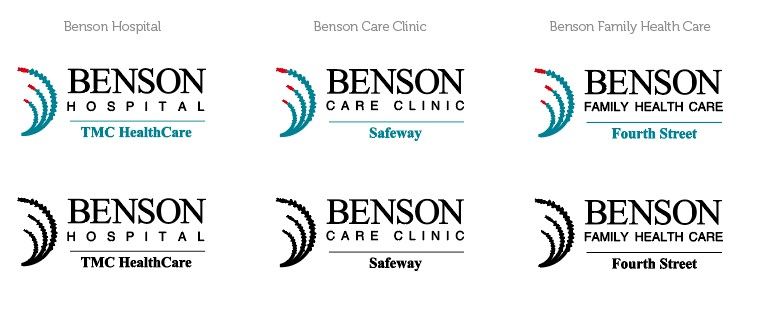
Benson Hospital offers a variety of services to the surrounding community. The visual component of the brand needed a cohesive system to provide a visual identifier for those services. This is done in a way that supports the overall brand and can be expanded upon easily as more services are developed.
RESULTS Benson Hospital now has a logo mark that represents its newfound affiliation with TMC while still having a connection to the community it supports. The ocotillo motif worked as a way to tie its visual brand to TMC while still representing the individuality of Benson Hospital.
View more Case Studies


Powered by PrinterPresence