

CASE STUDY
Cirrus Visual Brand Refresh
CLIENT Cirrus Visual, Tucson Arizona
PROJECT Brand Refresh
NEED Update Cirrus Visual branding to celebrate our 20th Anniversary
SERVICES Graphic Design
CHALLENGE The original logo is well liked, recognizable and had been in use for many years. However, the color palette and type styles had evolved over time and marketing material was starting to show visual inconsistencies on the whole.
SOLUTION It was determined that the logo did not need to be redesigned, but needed refinement, and definition on how to use the elements.
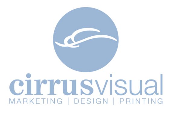
The Cirrus logo was originally created in 1998 by former Art Director, Paul Calendrella. It reflects the Cirrus cloud, which are the highest & fastest moving clouds & typically signal change in weather. It was intended to be an icon that stands alone for branding.
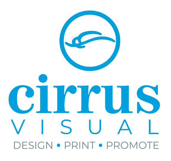
The logo was updated to be more contemporary with an outlined circle and thicker cloud icon. The intent was to make the logo readable at any scale. The outline style makes for a lighter, easy feeling and gives an element to play with.
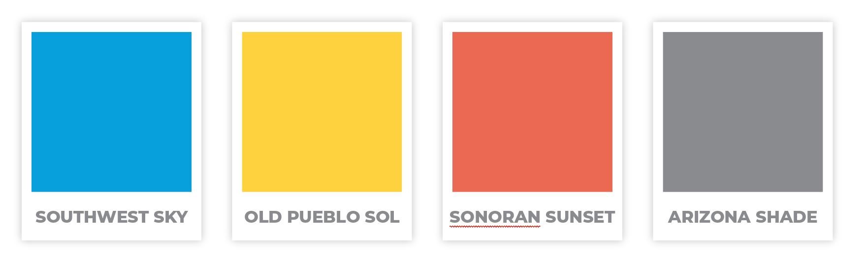
New, more contemporary colors were chosen, which also align with our print services by using versions of cyan, magenta, yellow and black. We even had some fun and gave them custom names.
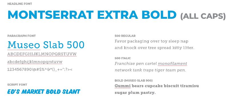
New typefaces were also chosen to refresh the brand and help readability.
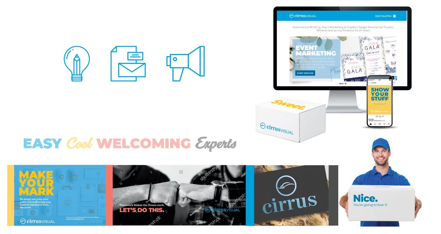
The outlined style of the icons was kept to maintain a contemporary feel, as well as complement the updated logo. Other applications will be updated, using bold image and text and message, with a friendly and welcoming approach.
RESULTS Immediately upon release of the new look and feel, we started hearing from clients with many positive reactions. The new logo, colors, style and voice have been applied to everything from our delivery vehicles to our business cards and continue to provide an endless resource of refreshing elements.
View more Case Studies


Powered by PrinterPresence