

CASE STUDY
Run Tucson Event Logos
CLIENT Run Tucson
PROJECT Event Logos Redesign
NEED Redesign their collection of event logos for consistency
SERVICES Graphic Design
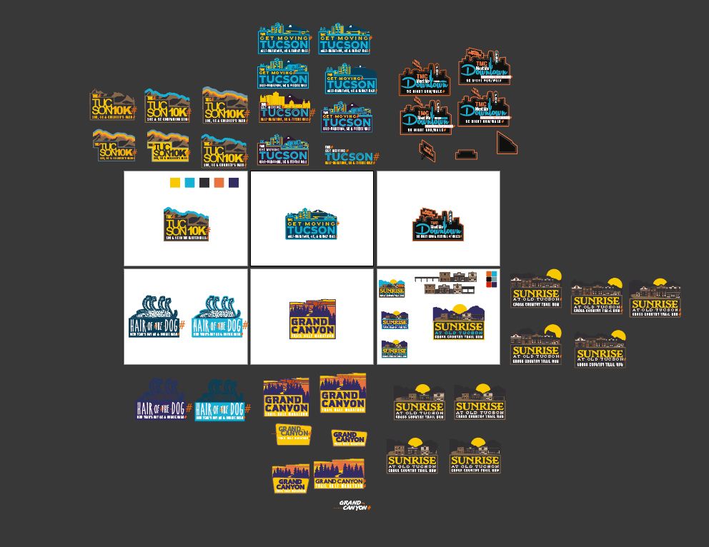
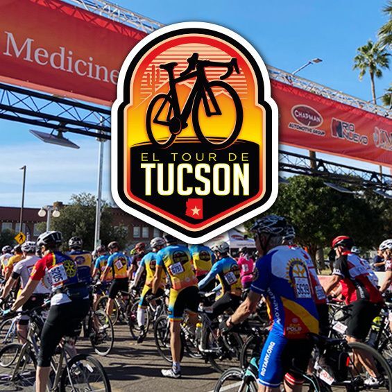
CHALLENGE “Run Tucson” is a local running event organizer, specializing in foot-powered races both on and off the road. The collection of their individual race logos has grown over the years, and the immediate need is to review and refine them to a consistent group of logos.
SOLUTION Cirrus developed a visual identity design system for Run Tucson’s race events, incorporating the existing style of each event while maintaining consistency as a group. The logo system still retains the unique branding marks of each event but finds harmony through a refined color palette and font pairing for the event description.
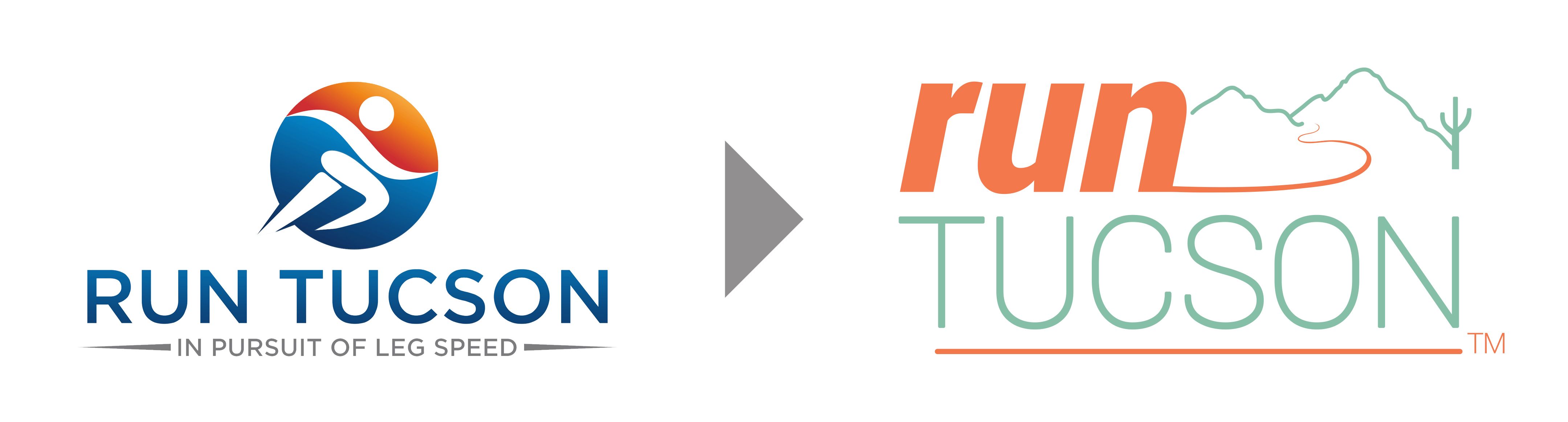
As the Run Tucson events grew organically over the years, so did the logo collection. Cirrus recently redesigned the main Run Tucson logo, and they realized the need for all their logos to be consistent.
Some logos needed just a refresh, while others needed a full redesign, but they all needed to follow a consistent shape proportion and look as if they're from the same race promotion company.
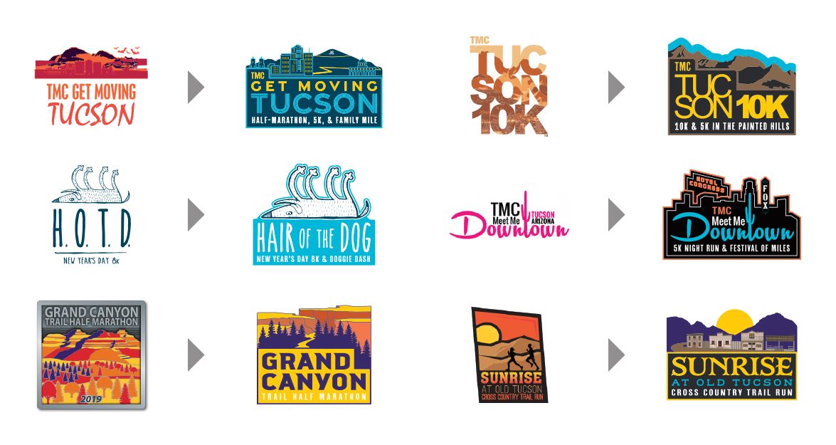
A 4:3 format was decided to be the winning proportion, and the logos were designed in a modular style to allow for additional info or dates to be added. We also developed a color system that allowed unique themes while still fitting in the palette.
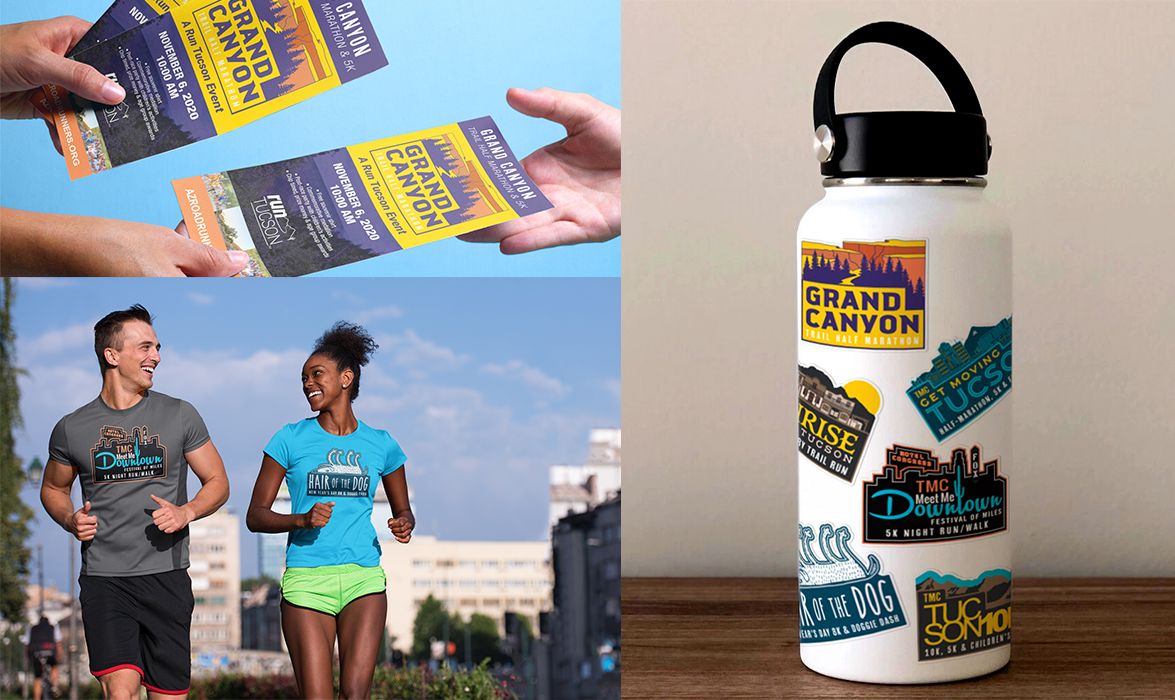
RESULTS The project was a success! The logos all live in harmony now, and we've set the stage to easily add new logos when events are added.
View more Case Studies
Powered by PrinterPresence